The purpose of this blog is to prove that the Bible has truths that permeate human, modern life - without necessarily having to be taught.
The goal is that visitors will appreciate the Bible as the Inspired Word.
Well, first post...
I first began getting interested in color theory when I was in high school.
I already had an interest in beauty, anything interesting and remotely anime since elementary school
- And by remote, I mean r-e-m-o-t-e... even the "American anime" hybrids.
Then one day, a friend introduced me to DeviantArt....
I made an account, I logged on, and I did more "faves" than I posted works...
And in my tiny teenage brain. that was constantly thinking about how I could make myself prettier - online - and figuring out what people liked, I thought:
"People are sheep, I know that. But even I seem to like the same pictures that everyone else is "faving"... And I know that it can't be a "sheep syndrome" - I am one individual away from being a "lone wolf", and my friend is not even on DA (DeviantArt) - let alone an artist...
"Why do most of the pretty peices of work, always feature the same color schemes? ...Red and cyan, blue and yellow...magenta and acid green.... hmmm ..
I was also taking psychology by now, so I had to know....
Then one day, as I was glancing through someone's Photoshop tutorial, I found a little bit of advise on color...
Colors across from each other are complimentary...
Who hooo! Like I didn't already know that. Blue goes with orange, red goes with Christmas green...
but wait! Blue was not across from orange, as I had been so taught since elementary school. It's accross from yellow...
...Like a sunny day...
The person's tutorial contained a screenshot, which had a color picker from Photoshop.
Red had cyan as complimentary, a color I had never heard of before...
Purple met with a bright green, but not yellow.
This artist's primary colors weren't right!
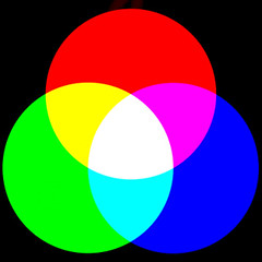
"additive colour" by dullhunk
After I stuck with this guy's idea of colors that work afterwards, until I learned that there were two kinds of color wheels.
The first wheel is based off of the subtractive color physics.
Physical materials absorb light.
When you see a strawberry red, that is because the strawberry's surface sank every other color except red. That is why you see red.
I am not very knowledgeable about physics and light, but from what I can understand, a material, like paint will absorb light waves differently than if it were "pure" light.
So even though your eyes tell you that teal and red are complementary, pigments with red and green will not create black or grey, but brown.
"Subtractive" primary colors will produce a very limited gamut of color, meaning that they will not produce all the colors we can see. It cannot produce magenta, teal (or cyan), or "bright" greens.
"Additive" primary colors, on the other hand, are produced when light, and not pigments are mixed. From here we can produce I believe, the full spectrum of colors we can see.
But of course, someone who had confused subtractive and additive colors, went around telling us that colors across from each other on a pigment wheel, actually "look good".
There's a difference between acknowledging that two colors mix to create a third, and then putting these colors on a chart to suggest that any of these colors are complimentary.
Purple and yellow are not complimentary. Anyone who tells you that purple and yellow are, needs to study color theory from someone who has a computer.
People,
Here's the next part: What do colors have to do with the Bible?
Next Page - (Page 2)
Page Page 1 | 2 | 3 | 4 | 5
No comments:
Post a Comment